New study/reading rooms for the University of Wuppertal
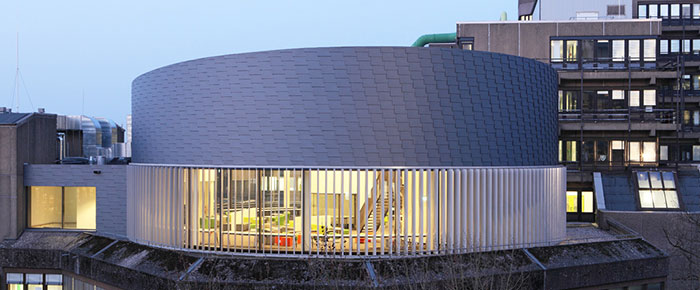
Surrounded by university architecture built in the 70s, a new modern cylindrical building is now enriching Wuppertal’s University campus by a new contemporary library space. Designed by Schamp & Schmalöer, an architect’s firm based in Dortmund, the library extension creates around 200 additional spaces for students to study and read. Particularly eye-catching is the structure’s façade. The bottom half is glazed all-round, affording a view across the campus and over Wuppertal itself. The top half of the building features hinged shingles made of pre-coated titanium zinc, arranged in a fish-scale-type manner which pick up the slate façades so typical for this region, known as the Bergische Land [mountain range region].
 A university’s architecture has considerable impact on students’ learning. Different types of study spaces - both for teamwork and individual study – facilitate learning for the individual student. Hence this aspect was given due consideration in the design of the new library extension of the Bergische University Wuppertal. On a floor space measuring approx. 600 m2 sits a cylindrical space that provides a learning environment that is adaptable to students’ needs.
Challenges during construction
 Particular attention had to be paid to structural analysis, as the new reading room was to sit atop the existing library building and as adding additional storeys must not overburden the existing foundations of a structure. To solve this challenging task the architects opted for a steel construction that would offer maximum stability while at the same time being of minimal weight itself. The rotunda with a diameter of 26 m was erected onto a load-distributing steel beam bed that absorbs the vertical load and distributes it onto the 7x7 m column grid below. Another challenging aspect was the execution of the extension works, which had to be carried out while keeping the library open to students during construction.
Basic cylindrical shape
 Sitting atop the existing library building in typical 1970s architecture, the rotunda stands out as a powerful independent structure. The cylinder stands as a symbol for a system of order – it develops as the third dimension from the circle. “This analogy can be traced back to the founding moral of this iconography of order in the same way that Prof. Dr. Werner Oechslin, Chair of Architecture Theory at the ETH in Zurich, draws on the Biblical story of Seth, who tried to store human knowledge collected since the dawn of mankind within two columns of fired clay to keep it save from the Great Flood. Two columns, i.e. with circular floor plan, which at the time of the Old Testament were sufficient to hold the collected wisdom of mankind", explains architect Richard Schmalöer. This elementary idea forms the basis for this building's modern design. At the same time a calm architectural envelope and matching interior that is mirroring the basic cylindrical shape, represents a space for knowledge and learning in an era of virtual worlds.
Special façade design
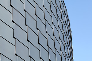
 Besides the cylindrical shape the extension building also impresses with a rather striking façade. The cylinder is sliced into two halves: The bottom part of the building with an all-round glazing front opens up a view over Wuppertal and University campus. Vertical-running aluminium solar shading doubles up as an attention-grabbing design feature. The top half of the building skin is clad in titanium zinc shingles in the surface finish "Pigmento blue", made by VMZINC. This colour was chosen in order to produce a look that would be in harmony with the existing building stock at the campus. As the adjacent concrete structures had been restored successively over time and were therefore sporting a light grey colour. Boehme Systems produced Classic Shingles, measuring 700 x 400 mm, which feature a u-shaped surround. The fish-scale type layering of the shingles replicates the slate façades so typical for the Bergische Land and gives this local building tradition a modern look. Thanks to a special bending technology these shingles come with a u-shaped surround which increases stability and protects them against being lifted off in strong winds. The totally sealed surface prevents any water from penetrating even under lashing rain and high winds. The organisation of the curtain-type, rear-ventilated façade also consists of two layers of vertically laid, pre-rounded trapezoid plates fitted with a 160 mm thick mineral wool insulation layer. Angular aluminium plates provide further thermal insulation.
Design of the interior
 Inside the new reading room are 200 stations to read or study, offering a range of different learning facilities. The space with a ceiling height of 6 m houses a couple of glazed cylindrical storeys, the lower of which may be used for meetings or conferences. Lounge-type areas in the conference spaces provide relaxed corners to sit and chat. Other interior sections are ideal for intense study in small working groups or for teams to prepare presentations and events. Coloured light domes break up the ceiling area and allow daylight to flood into the centre of the reading room.
Both interior and exterior designs by Schamp & Schmalöer use the basic cylindrical form as their key element, resulting in a modern architecture that not only creates a highly productive learning environment for students but also greatly enhances the university campus.
Building blackboard
 BOEHME® SYSTEMS Product: Classic Shingle, Type Rectangle Vario
Quantity: approx. 400 m2
Material: Pre-Weathered Titanium Zinc from VMZINC
Surface: PIGMENTO blue
Building owner: Bergische Universität Wuppertal
Architect: Schamp & Schmalöer
Installer: Metalltechnik Wachsmuth GmbH
Drawings: Schamp & Schmalöer
Pictures: Hans-Jürgen Landes
